


Brutal Time: Typographic Clock
By Forager Lab

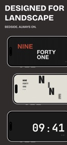


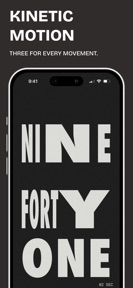
Brutal Time is a typographic clock app for iOS that displays time through grid-based, brutalist-inspired movements.
The App DNA
What makes this app unique?
The app removes the cognitive load of decorative clock interfaces, serving users who prioritize visual clarity and deliberate, unhurried motion.
For Design-conscious users and individuals seeking a minimalist, brutalist-inspired clock interface for their devices.
What does it look like?
Key features
Continuous, ambient motion applied to typography that breathes and sways on the screen.
Four distinct visual styles including Concrete, Index, Neo-Swiss, and Colossal.
Display time information directly on the iOS home screen.
How much does it cost?
The one-time purchase model avoids recurring subscription costs, appealing to users who prefer ownership over ongoing payments.
Velocity
Maintenance developmentperformanceopaqueShow more...
The app maintains a maintenance-level cadence, shipping only one release in the observed window. The latest release focused exclusively on internal reliability and maintenance, with no new features or content introduced. Development appears stable but limited to technical upkeep rather than active feature expansion. The publisher provides no insight into specific changes, keeping the changelog generic.
Who built it?
Forager Lab
3 apps tracked · Utilities
 SPECTRA / Weather
 bond - gentle dog care
User Sentiment
What do users think recently?
How are ratings & reviews evolving?
Not enough recent reviews to extract reliable themes yet.
Read the full review analysisCompetition
Competitive landscape for Brutal Time: Typographic Clock
How's the Utilities market?
Brutal Time operates in the Utilities category with a focus on aesthetic differentiation. The lack of a subscription model positions the app as a low-friction alternative to recurring-revenue clock utilities.
Read the market outlookThe rivals identified
Unlock the deeper market read.
Access the full report for freeThe Analyst's Read
Key takeaways for Brutal Time: Typographic Clock
Where is it heading?
The minimalist utility market is consolidating around apps that offer high-fidelity widget customization. Brutal Time remains stable, but the lack of active feature expansion leaves it exposed to rivals that can iterate faster on visual trends.
- The current maintenance-only cadence suggests a stable, finished product rather than an actively evolving platform.
The SWOT
- Brutalist design language creates a distinct visual identity
- Kinetic Motion provides a non-repetitive, ambient visual layer
- Expanding typographic library could capture design-focused segments
Next best moves
Ship a community-driven typographic movement gallery because the current library is static → increase long-term retention
The counter-intuitive read
The lack of frequent updates is a feature, not a bug…
Read the full takeSince the last report: The product strategy shifted from a static maintenance focus to a proposed community-driven content loop, aiming to mitigate retention risks. This pivot prioritizes user-generated typographic galleries over the previous roadmap of expanding internal design assets.
Bottom line
Brutal Time succeeds by maintaining aesthetic purity, but the current maintenance-only cadence leaves it vulnerable to faster-moving rivals. Introducing a community-driven content loop would unlock the engagement needed to defend its position against generic, ad-supported clones.
Unlock 2 critical frictions, 1 market threat and the analyst’s take.
Access the full report for freeFAQ
Is Brutal Time worth paying for if I only want a simple clock?
Does Brutal Time have intrusive ads or subscriptions?
What is the difference between Brutal Time and standard clock apps?
Sources
- [1] App Store
Report last updated