


POP Time Watch Face
By Time Design


POP Time Watch Face is a digital watch face for Wear OS smartwatches that features a retro comic-book aesthetic.
The App DNA
What makes this app unique?
The app removes the need to navigate through multiple menus by surfacing health and activity metrics on a single, high-visibility screen.
For Wear OS smartwatch users who prefer minimalist, retro-inspired digital watch faces.
What does it look like?
Key features
Bold graphics and retro fonts provide a visual identity that differentiates the interface from generic digital styles.
Integrated heart rate, step counter, and calories burned metrics increase daily active usage by providing persistent health data visibility.
Maintains visibility of time and data in low-power mode, ensuring the watch face remains useful throughout the day.
How much does it cost?
The app is distributed as a free product to serve as a top-of-funnel acquisition tool for the developer's broader watch face catalog.
Velocity
Dormant developmentopaqueShow more...
POP Time Watch Face has seen no development activity for 237 days. With only a single version recorded in the analyzed window and no updates since late 2025, the app is currently in a state of stagnation. There is no evidence of ongoing maintenance or feature development.
Who built it?
Time Design
13+ apps tracked · Personalization
 Sand Beach Watch Face
 Dark Mechanism - watch face
 Energy Pulse Watch Face
 Alpine Noir Watch Face
 Old School Watch Face
 Analog Classic Watch Face
 Neon Aura Watch Face
 Royal Hour Watch Face
 Neon Riot Watch Face
 Celestial Observatory
 Dark Hub Watch Face
 Space Explorer Watch Face
User Sentiment
What do users think recently?
Fresh user feedback skews excited. Users appreciate retro-styled visual design provides a clear and engaging interface for quick information glances and comprehensive data display allows users to see all relevant health metrics at a single glance.
How are ratings & reviews evolving?
What users say, by theme
- Retro-styled visual design provides a clear and engaging interface for quick information glances
- Comprehensive data display allows users to see all relevant health metrics at a single glance
- Installation process complexity and technical failures prevent users from successfully applying the watch face
36 of 36 recent reviews analyzed · high confidence · Excited overall
Read the full review analysisUnlock 2 more frustration themes and 1 user request, each backed by review evidence.
Access the full report for freeCompetition
Competitive landscape for POP Time Watch Face
How's the Personalization market?
POP Time Watch Face competes in the personalization category with a 4.76 rating across 1,293 total ratings. The lack of recent updates compared to active rivals signals a maintenance-mode posture that risks losing visibility to more frequently updated competitors.
Read the market outlookThe rivals identified

By Enkei Design
ZION Blue competes directly for the same Wear OS personalization market by offering a high-density, feature-rich digital interface that targets the same power-user demographic as POP Time.
- Features an edge indicator toggle for visual status updates that POP Time currently lacks entirely.
- Offers a more robust library of custom app shortcuts, allowing for deeper user-defined workflow integration.
- Maintains a significantly larger user base with over 4,600 ratings, providing stronger social proof and visibility.
 Flower Digital FLW036Contender
 Analog Classic 5 Wear OS4Contender
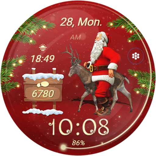 Santa Claus & ChristmasContender
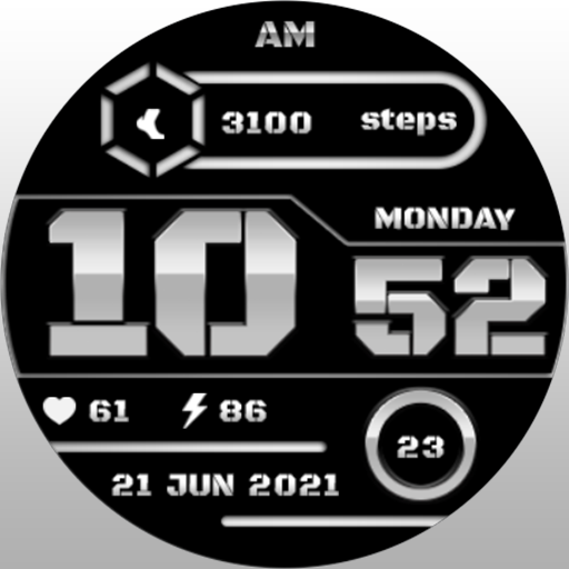 MJ069 White Digital Watch FaceContender
Unlock the head-to-head verdict: where this rival wins, and where it loses.
Access the full report for freeThe Analyst's Read
Key takeaways for POP Time Watch Face
Where is it heading?
The personalization market is consolidating around watch faces that offer deep complication customization, a trend that POP Time Watch Face is currently missing. Without a return to active development, the app will continue to lose ground to rivals that provide both visual style and functional utility.
- The seven-month update gap suggests the app is in maintenance mode, which prevents it from addressing critical installation failures reported by users.
- Installation failures prevent users from applying the watch face, which directly limits the growth of the daily active user base.
The SWOT
- Distinct comic-book aesthetic differentiates the interface from generic digital styles
- Adding user-defined complication shortcuts would neutralize the functional lead of rivals like ZION Blue
Next best moves
Rebuild installation flow because multiple reports of installation failures prevent users from applying the watch face → increase conversion
+ 1 more prioritized moveThe counter-intuitive read
The app's lack of customization is not a…
Read the full takeFeature gaps
User-defined complication shortcuts (available in ZION Blue but missing here) +1
Since the last report: The app's competitive outlook has shifted from stable to declining due to a persistent seven-month development gap and unaddressed installation failures. While the core feature set remains static, the analysis now explicitly identifies the maintenance-mode posture as a primary threat to market visibility.
Bottom line
POP Time Watch Face must resolve its installation failures to stabilize its user base, as the current technical friction is eroding the value of its distinct visual branding. Addressing this will unlock the retention potential of its retro-comic design.
Unlock 2 critical frictions, 1 market threat, 1 more prioritized move and the analyst’s take.
Access the full report for freeFAQ
Is POP Time Watch Face compatible with my smartwatch?
How does POP Time Watch Face compare to ZION Blue?
Why is the watch face not appearing on my watch?
What are some alternatives to POP Time Watch Face?
Sources
- [1] Play Store listing
Report last updated