


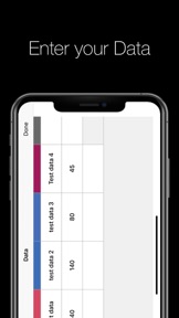

The Data Visualizer is an iOS utility for creating bar, pie, line, and bubble charts from CSV data.
Product velocity
Maintenance
Daily rank 🇺🇸
—
Graphics & Design
Sentiment
3.5
2 reviews
Nemesis
Fragmented field
The App DNA
What makes this app unique?
Users hire this app for offline, native data visualization that avoids cloud-dependency, but the current feature set fails to support professional multi-column analysis.
For Beginners and professionals needing a native, offline tool to convert CSV data into visual charts for personal or presentation use.
What does it look like?
Key features
Displays created charts directly on the iOS homescreen. Revenue link: Increases daily app visibility on the homescreen, reinforcing the habit of checking data visualizations.
Allows users to upload external datasets for visualization. Revenue link: Lowers friction for professional users to migrate workflows into the app.
Processes all data visualizations locally without requiring an internet connection. Revenue link: Reduces server-side infrastructure costs, supporting a free-to-use model.
How much does it cost?
The app is currently distributed as a free utility with no visible subscription or IAP gates.
Velocity
Maintenance developmentopaqueShow more...
The Data Visualizer has not seen a new release in 191 days, placing it firmly in a maintenance state. The latest version provided no descriptive release notes, offering no insight into potential bug fixes or performance improvements. Development appears to have stalled, as there have been no feature updates or operational events within the analyzed window. The lack of activity suggests the app is currently in a period of inactivity.
Who built it?

User Sentiment
What do users think recently?
The recent review mood reads frustrated.
How are ratings & reviews evolving?
What users say, by theme
- Data visualization constraints prevent users from selecting multiple columns for the vertical axis during analysis
1 of 1 recent reviews analyzed · limited sample
Read the full review analysisUnlock 1 user request, each backed by review evidence.
Access the full report for freeCompetition
Competitive landscape for The Data Visualizer
How's the Graphics & Design market?
The Data Visualizer operates as a niche, free-to-use utility with a 3.5-star rating. The lack of updates for over 6 months signals a maintenance-only posture that limits its ability to compete with active graphics tools.
Read the market outlookThe rivals identified
Unlock the deeper market read.
Access the full report for freeThe Analyst's Read
Key takeaways for The Data Visualizer
Where is it heading?
The graphics utility market is consolidating around tools that offer seamless cross-device collaboration, leaving offline-only apps like The Data Visualizer increasingly isolated. Without a pivot to address professional data-comparison needs, the app will likely see continued stagnation in user acquisition and retention.
- The 6-month update silence indicates a lack of feature investment, which signals to users that the app is no longer a priority.
The SWOT
- Native offline architecture eliminates server-side latency and infrastructure costs
- Integrating multi-column axis support could capture the professional segment currently blocked by existing constraints
Next best moves
Ship multi-column y-axis support because it is the top-requested feature in reviews → unlock professional user adoption
The counter-intuitive read
Users report: The app's lack of cloud-sync is its primary strength…
Read the full takeSince the last report: The app remains in a stagnant maintenance state, but the competitive outlook has downgraded due to the widening gap between its offline-only model and the industry's shift toward cloud-integrated collaboration.
Bottom line
The Data Visualizer offers a stable, offline-first experience, but the lack of multi-column axis support creates a hard ceiling for professional utility, so the PM should prioritize feature parity to prevent churn to more active competitors.
Unlock 1 critical friction, 1 market threat and the analyst’s take.
Access the full report for freeSources
- [1] App Store, source
Report last updated